Brand Design

    Asheville Design Salon.

    0

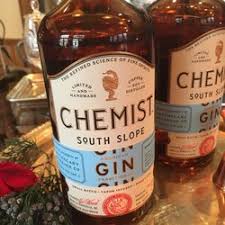
    I attended my first Asheville Design Salon last night and enjoyed it immensely. It was held at The Antidote, a cool cocktail bar (order the Daiquiri), attended by maybe 20-30 designers.  There was a very smart presentation on the development of new local spirits brand called Chemist Gin. The brand design was near impeccable: the bottle, mark, the typeface, coloration – very tight and well-knit. The second presentation was a bit broader, conducted by Big Bridge Design, showing some nice work in beer packaging plus some smart experiential thingies.

    What I took away from the presentations — and yes to a hammer everything looks like a nail — was the fact that there is a lot of talk about brands but little discussion of brand strategy. Or brand briefs. The discovery and strategy, prior to stylus to tablet, was all conducted by the client and designer. No independent middle ground. No real paper strategy that I could tell.

    What do they say about criminals being their own lawyers? (Okay, bad analogy.) And designers are geniuses at grabbing consumers by the eyeballs but neither client or designer really schooled in creating an “organizing principle for product, experience and messaging.”

    Can’t wait for my next Design Salon. 

    Peace.


    Brand Strategy Trumps Formula.

    0

    When is faster not faster?  And when does modular, formulaic construction create an inferior product?   The answer is in marketing communications. Here’s how this shizz should work.  After all the money discussions are complete, after the bosses shake hands, and proprietary company information is exchanged, someone with strategic  bone at an agency should write a brief.   Brand brief, creative brief, project brief, call it what you will. If there is not a strategic idea within the brief that feels right (and I do mean feel), that inspires pictures and music in the heads of the creators and developers, then the brief is poor and should be rewritten.

    Time to market.

    Once a brief is right and approved (and be prepared for some fighting, fear and diplomacy), only then should creative work begin. A tight brief is the fastest way to good work. For those who like metrics, a tight brief gets to approved work faster.  Approved work gets produced faster. Produced work gets seen faster. And organized, singular work – be it banner, website, promotion, direct, promotion or advertising – gets acted upon by consumers faster.

    Where the system breaks down is when the strategic idea is unclear. As creators of marketing deliverables become more process focused and less idea focused, as they become more formula driven, the work suffers. Formula replaces the cerebral cortex when creators are uninspired.  I wrote a brief for a friend’s commercial maintenance company that took some real digging.  The brief likened his operation to that of a team of Navy Seals.  That’s who they were.  That’s who they will be. The company is  “fast, preemptive and fastidious.” That’s a plan creators can get behind – without formula or module. That’s brand design. Peace.

    Brand Design vs. Product Design.

    0

    Which comes first?  It’s not a trick question.  And I won’t go all “sort of” on you.  The answer is product design.  A good brand planner will take the product design, understand it and package it.  A great brand planner, while packaging the product will “inform” it — change, evolve, aspire it and help create its future.

    Brand planners know when you see a friend’s baby for the first time there’s a difference between “What a beautiful baby” and “Ooh, what an amazing rosebud mouth.”  It’s the different between talking an observing. Most marketing today is talk. When you talk to a product designer and really see what they have created, you connect.  Just like when you really see someone’s baby.

    In today’s commodities world (see yesterday’s post on banks and healthcare), it is imperative for planners to find the difference.  It may only be a DNA-like strand, but it’s there. And once found that difference can give form to the brand idea.  Not a tagline, not a campaign, but a brand idea: The world’s information in one click. Refreshment.  Different.  The people who tell you brand design comes first are probably art directors. Or peddlers of marko-babble.  Peace be with you and with Lara Logan and her family.

    Brand Identity…or Ornamentation?

    0

    Wikipedia defines a brand as an identity.  Many years ago, while excavating a late woodland Indian shell midden on Moshier Island for the University of Southern Maine, I came across a piece of deer rib bone I assumed was some type of weaving shuttle. (It wasn’t my day job.)  It had some notches on the bone which gave it a unique appearance and I wondered if they were ornamental or a personal identifier. 

    Outside branding nerds, many in marketing today don’t quite know the difference between identifier brands and ornamental brands.   What’s the Idea? builds and rebuilds identifier brands.  Only then do we allow them to be ornamented.  And that dress up, as beautiful as it may be, must add to the identification story.  Go into a room, turn off the lights and listen to the voices of your friends and family. You can identify them.  But if you feel their clothes, not so much.

    The big girls and boys know this.  Whenever an Interbrand, Landor or Wolff Olin starts a new  logo project they create a brief; one that sets the identity direction.  Recently for a commercial maintenance company I developed a strategy suggesting they were the  “Navy seals” of maintenance.  Preemptive, fast and fastidious.  When the art director went off to do logo designs, he had a directive. When the client reviewed designs, he knew “how to buy” and “what to approve.”  Of course some ornamentation got in the way and he wanted to be a “green” company and, and, and.  But the CEO ran his group with navy seal precision – it was the company. It was his identifier.   The mark and brand organizing principles where hard to debate.  This is how we do-oo it!.  Peace.

    Rebrand…Best Western vs. Holiday Inn

    0

    I did a little driving this past week and noticed two rebranding efforts in the hospitality sector.  Holiday Inn did their’s a couple of years ago and Best Western more recently.  I wonder what each company paid for their rebrand efforts. If anyone knows, please share with me. It seems a no-brainer that one job was worth its weight in design gold, the other not so much.

    Holiday Inn’s logo is contemporary, active, clean and refreshing. It suggests the same approach was taken renovating all the properties.  Though green is not one of my favorite colors, I have to admit the mark, type and name treatment work wonderfully.

    The Best Western logo on the other hand, looks like a too-cool-for-type-school designer worked on it and it’s way over our heads, or, it was crafted by the CMO’s daughter who cuts hair in Jersey City.  (Not that there’s anything wrong with beauticians or Jersey City.) The Best Western logo is the opposite of Holiday Inn: Logy, a tad unkempt, colorless and sans any fashion sense. Close your eyes and imagine what the new room designs must look like. That is, if they were done at all.

    Logo and style manual design in a rebrand isn’t everything but it’s a HUGE thing.

    McPeace.


    Proof under development.

    0

    When developing brand strategy I look for the claim then search for 3 business-building planks that support that claim. Proof planks, in other words. Proof can be tangible or it can be developmental and additive.  What do I mean by developmental and additive? Let’s just say it’s a goal and we may not be there yet — it’s under development. From a messaging point of view we may not have the scientific proof yet, but we know how to talk about it. Sympathize with it. And celebrate it.

    Were I selling for Taco Bell and had a proof plank about using ingredients imported from South and Latin America, I might talk about the qualities of those ingredients that make for a uniquely South American taste (soil, sun, mountains).  In the meantime, while that proof is under development, the company had better be looking for real sources. Proof under development is a little like working at a start-up, it’s about what you know, not what you make – about what your mission is, not what you can deliver right now.

    This may sounds disingenuous, but it’s not. I would never suggest lying or misleading. In the Taco Bell example it would have to be known that, say, the peppers were from the arid southwestern US – but the story has a beginning, a direction and a motivation.  Peace.

    Microsoft Tiles

    0

    The more I see and hear about the Windows 8 Operating System by Microsoft, the more I realize Steven Sinofsky should have named it “Tiles.”   Language is a funny thing.  Market research is great, ideation is great but user ballast is greater.  We don’t really have the foresight sometimes to see the words the general population will adopt surrounding a product, so we try to force language on them.  But organic user language, the linguists will tell you, trumps marketing.

    I believe in this name so completely, I predict it will be adopted by Microsoft and replace Windows as perhaps the most known brand names in technology. (And BTW, Stop Brand Diaspora!)

    Short post. Big claim. Peace.

    The junk economy.

    0

    I like to write about trends that impact marketing. One such, is the craft economy. It’s an exciting movement that is slowly taking hold and can be seen in craft beer, home-made pasta, woodworking and the neat site Etsy.  What makes the craft economy a trend worthy of notice is the bigger phenomenon that has lived here for too long: the junk economy.  Junk food, junk games, mass produced-low quality gear. When ladies can go to Target and pick up a blouse for $6.00, something is wrong.  When it makes more sense to buy a new laptop than fix the old one, something is wrong. When a TV only lasts 5-6 years rather than 15, something is wrong.

    I love old stuff.  I am old stuff. I have tee-shirts older than my 20 something kids.  My old Poppe Tyson softball tee just ripped.  Pissed I didn’t buy a better weight of cotton Hanes back in the 80s.

    Junk is bad, craft is good. Market with that thought in mind and the messages and customers will follow.  Eric Ripert has built an empire on fighting the junk economy. He is an inspiring hero.  Lose the junk. (Not that junk Terrence. Oh, and Terrence, Pearl Jam is coming to Philly.) Peace.


    Market Like It’s A Craft.

    0

    I was reading Ana Andjelic’s  newsletter, The Sociology of Business, this morning and came across a dinnerware company called Caskata. My first introduction to the company was through the website. There is lots to like about this company.

    First, the products are exquisite. The colors and designs are candy for the eyes. Second, they are front and center on each page. Celebrated. Photographed brilliantly, with accents like a crusty baguette on a rough-hewn, spalted maple table.  The beautiful dinnerware is the hero. There is a level of taste here that few websites achieve. And where there’s taste in art direction and photography, there has to be taste in product – so the consumer mind goes.

    This is how you build a website. You herald the product. Don’t overdo it with pictures of smiling, happy people. Bleed the product shots to the fullest extend of the page. Use empty space as an accent. In other words, art-direct your product and home page like it’s your first and only baby.

    But what I like the best about Caskata is the product designs themselves. They are amazing. They get the product right first. It’s hard to herald a plain product.  

    We throw around words like “brand” (verb) and “creative” and “design” too easily these days. They are crafts. Expensive crafts. You can’t buy them on the web by the pound.

    You don’t have top be a craftsperson to use a craftsperson. You just have to respect the craft.

    Peace.


    Brand Design

    0

    What I do for a living is Brand Design. Not with a color palette or artist’s eye, but with words, deeds and strategy. Building an infrastructure upon which strong, powerful brands are built is the collective goal. Only when the infrastructure is solid does it make sense to start fueling the commerce engine. 

    Midtown, NY is one of the easiest megalopolises in the world to navigate because it was designed. It uses a grid system with numbers and compass points to help people find their way. Greenwich Village, on the other hand, is laid out with curves and bends and family names and nary a navigational design element to be found. It’s like it was pasted together with available parts one year at a time. 

    Many people in the startup world today, especially those without B-school educations, begin their quest with a product and Google. A search consultant will cast a net into the ether, filled with random search words, looking to see what comes back. Efficiency and cost per click do not a brand or business build.

    It takes a plan. And brand design is an elegant and savvy place to begin.

    Peace.